Most likely you have come across a radar speed sign like this:
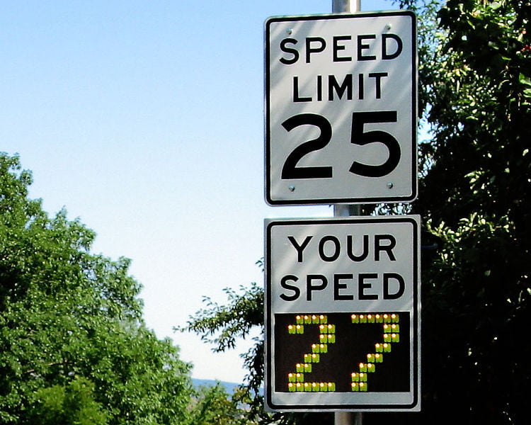
You probably slowed down if the sign indicated you were travelling too fast. Experts tell us that these radar speed signs are highly effective. "Studies repeatedly show that when alerted by a radar sign, speeders WILL slow down up to 80% of the time. Typical average speed reductions are 10-20%, and overall compliance with the posted speed limit will increase by 30-60%." * Even after years of repeated exposure to the same signs, drivers continue to reduce their speeds and even continue driving at safer speeds for the next few miles.
Have you ever stopped to consider why these signs are so effective? A simple speed limit sign, combined with a quick glance at your odometer, should be enough to tell you that you are driving too fast and should adjust accordingly. But it often doesn't work this way. Psychologists tell us that the reason these signs are so effectiveness is that they create an immediate feedback loop. It's an external source that gives us feedback on performance, followed by the chance to change our actions. **
In a previous blog article about Brand Wings analytics, we covered trends and targets. Both are examples of providing a feedback loop to you. At a quick glance, much like seeing a radar speed sign, you can view how actual performance in a given area compares against where it should be. In this article we will cover an approach that provides an even more focused assessment of performance: A KPI chart.
KPI stands for Key Performance Indicators. Much has been written about this on the internet and we encourage you to spend some time reading on this important topic. In its essence, a KPI is a specific performance measurement of a well defined business goal. A KPI typically includes ranges for that measurement that indicate if the result is good, acceptable, or bad. Let's take a look at three examples:
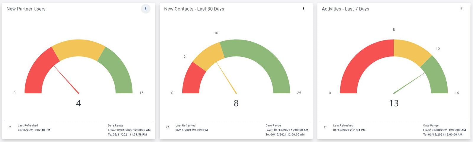
A very quick glance at these three charts immediately gives me three important pieces of feedback:
- My channel partners are not adding new users at the rate I am expecting. I need to look into this immediately.
- New contact growth isn't terrible, but it's not where it should be either. I should probably investigate this at some point soon.
- Activities are doing well. My channel partners are performing activities that will lead to sales. I don't need to worry about this right now.
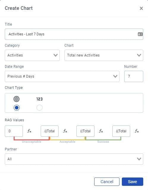
Defining the KPI chart in Analytics is straight forward. After selecting the chart type and date range, be sure to click the KPI chart type, which looks like a bullseye.
RAG Values stands for Red, Amber, Green values. It's important to give serious thought to these values, as they will ultimately define the feedback loop for the chart.
You should seriously consider using formula based RAG values to ensure that targets change appropriately. In this example, I am using a multiple of the total number of Partner users. For example, the maximum Green value is the total number of partner users times 4. This means that as more partner users are added, the threshold for success will increase automatically.
We sincerely hope that Brand Wings Analytics help you manage your channel partner operations more effectively. As always, feel free to contact us if we can help you be more successful!
* www.radarsign.com/how-effective-are-radar-speed-signs
** www.speedpatrol.com/why-radar-speed-signs-are-effective-in-reducing-speeding/
Image from https://commons.wikimedia.org/wiki/File:Radar_speed_sign_-_close-up_-_over_limit.jpg