This week, the Brand Wings through-channel marketing automation platform deprecated its predefined dashboard charts in favor of a fully customizable Analytics module. This is the first of three blog articles explaining how to get the most out of Analytics.
Within Brand Wings, a simple example is understanding which Assets your channel partners are using. Analytics can easily create charts in a variety of formats to give you a quick visual understanding of asset usage within your account. Beyond this, Analytics can optionally draw trend lines based on a linear regression model. This can help you “make sense” of the highs and the lows to understand the overall trajectory of the usage. Going one step further, Analytics also allows you to define targets for your charts using numbers or formulas you define. This provides even more immediate insight into your asset usage as you can quickly see if it’s aligned with your expectations or not.
Before we go further, let’s take a step-by-step approach to configuring Analytics.
Step 1: Configure Permissions
The Admin Role for your user account needs to be configured first to allow you to create and manage Analytics. Manage the specific Admin Role and grant all permissions for the Analytics row:

Step 2: Create a Dashboard
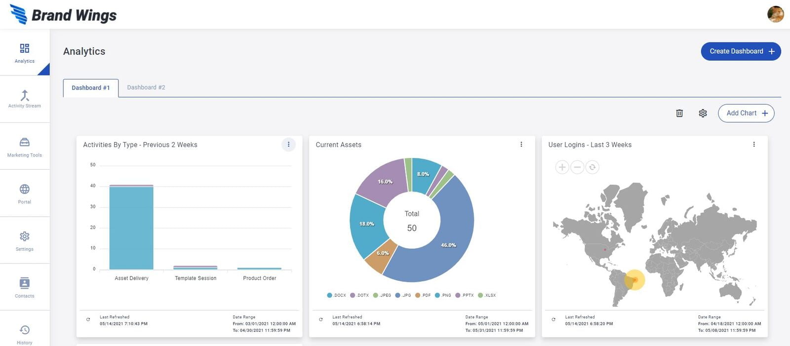
Analytics are delivered in dashboards full of charts and graphs. You can define as many dashboards as you would like. You can even set some dashboards as shared, meaning other admin users will have access to view (but not edit) them.
First, click on the Analytics icon. Next, click on the Create Dashboard button. Give it a name, check the box to share it, and then click Save. You now have a new dashboard to work in.
Step 3: Create a Chart
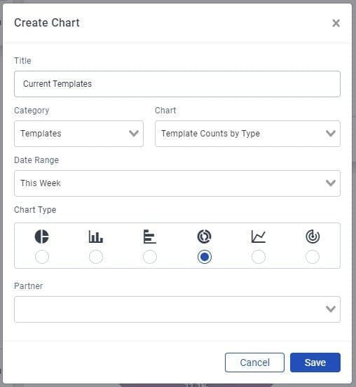
Click the "Add Chart" button. This opens a window allowing you to give it a name and select the chart type. Charts are grouped by categories. After selecting a category, you may select the specific chart.
The Date Range selection is important, as all charts are based on a point in time. While you could set specific dates, you will generally want to set a relative range like "Previous # Weeks" and a value of 2. This means that you will always see data from the previous two weeks no matter when you login, rather than needing to manually update the dates selected.
Depending on the chart selected, you'll be able to select the chart type. Brand Wings supports multiple chart types, including:
- Pie & Donut
- Vertical and Horizonal Bar
- Stacked Vertical and Horizontal Bar
- Line
- Radar
- Map
- KPI
Lastly, you may filter data down a specific partner. By leaving it set to "All" you will see aggregated data across your entire account.
Step 4: Arrange Your Dashboard
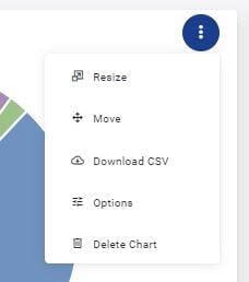
You may add as many charts to your dashboard as needed. As you are working to configure your dashboard, you will likely want to make some changes. In the upper right hand corner of each chart area are three dots, indicating that there are some options. Clicking or tapping opens a list of choices.
You can choose to move or resize the chart. As you move or resize, other charts will shift their positions to make room.
To get quick access to the underlying data for the chart, choose Download CSV. This file can then be opened in Excel or any other spreadsheet application.
To make changes to the chart configuration, including changing the style or the chart or the date range, click on Options. If you want to refresh the chart (data is cached for a short period of time) click the refresh button at the bottom left hand corner of the chart area next to the date indicating when the chart was last refreshed.
In our next article, we will learn about using more advanced features such as Trends and Targets. Until then, enjoy the new Analytics module!